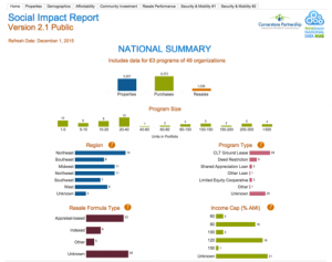
In August 2015, Cornerstone Partnership released a public, interactive dashboard with aggregate data from the HomeKeeper National Data Hub. This online tool allows policymakers, researchers, and practitioners to explore key social impact data evaluating the performance of the affordable homeownership sector. Overall, the data affirms the stories we’ve been telling about the power of share-equity homeownership models. The programs in our dataset are successfully expanding access to homeownership and balancing the need for wealth creation and affordability preservation across market cycles and diverse local conditions. We’d like to share a few key insights with you now, and suggest ways that this data can be used to advocate for shared-equity models and strengthen the sector.
 Our dataset includes transaction data from 64 different shared-equity programs with over 6000 transactions, 1000 of which were resales. The programs represent a broad range of regions, housing markets, program sizes, and program types, including Community Land Trusts, deed restriction programs, shared appreciation loan programs, inclusionary housing programs, and Limited Equity Housing Cooperatives. In total, the programs have stewarded over $330 million in subsidy, with a total sales volume of more than $1 billion.
The typical transaction offered a home with an appraised market value of $179,000 at a subsidized price of $118,000. The typical household earns 64% of local AMI and spends 28% of gross income on housing costs.
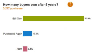
 After 5 years, 94% of buyers either still own their home or have sold and purchased another one. This demonstrates the incredible impact of the stewardship services these programs provide. Studies have shown that at least half of low-income buyers on the fee-simple marketplace are no longer homeowners after 5 years.1 Our programs’ foreclosure rates are also extremely low. As of December 1, 2015, only 0.46% of all current owners were in the foreclosure process, compared to an estimated 2.09% of all homeowners nationwide, regardless of income level.2
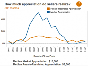
The resale data illustrates clearly the success of these programs’ resale formulas in balancing affordability preservation with wealth creation across diverse market conditions. For each year, the line chart below plots the typical resale’s total market appreciation in blue and the seller’s restricted appreciation in orange.  It shows that during the housing bubble of 2002-2008, these programs limited sellers’ shares of appreciation in order to preserve affordability, and then during the crash of 2009-2014, protected them from losses. Overall, at the typical resale transaction, the original subsidy grew from $36,000 to $46,000, as a portion of market appreciation was recaptured and reinvested. The typical seller, who had originally invested $2500 in their downpayment, received a gross of $6500 as their share of appreciation, plus an additional $6500 in equity as the result of their monthly mortgage payments. And the typical price for the next buyer was actually slightly more affordable, relative to local AMI, than the original buyer’s price had been.
This gives you a snapshot of the sector overall, but this new interactive tool allows anyone to drill down into the data using a series of customizable filters, in order to answer specific questions about how performance varies across a diversity of market conditions, program types, regions, and demographic profiles. The possibilities for a more nuanced understanding of the sector’s performance are endless. We invite you to interact with the data and share your insights with us. Visit the dashboard now.
The dashboard was created with support from the National Community Land Trust Network, the Lincoln Institute of Land Policy, the Salesforce.com Foundation, The Ford Foundation and Morgan Stanley.
********
1. Herbert et al, “The Homeownership Experience of Low-income and Minority Households,” Cityscape 10 (2), 2008)
2. Mortgage Bankers Association, National Delinquency Survey, 2nd Quarter 2015 – http://bit.ly/1LuIkWh
