Are you a Housing Counseling Agency looking for a new CMS? Learn more here.
Your Social Impact Report Primer: 7 hard questions that just got easier to answer
You’ve worked hard to get all your data into HomeKeeper so that you can get a Social Impact Report. Congratulations, you now have one! Now what? The Social Impact Report provides you with a unique perspective of your program that goes far beyond the common outcome metrics of counting units and dollars spent. It may not ask every question you might be wondering or have all the answers, but it’s a great place to start expanding your understanding of program outcomes.
Now that you have your report, set aside some time to review it with your program team and organizational leadership. Look at the charts, generate more questions, more discussion and more insights. Turn your insights into action by making your case louder and your program stronger.
Don’t know where to get started? Here are seven hard questions you can now easily answer:
You can use your Social Impact report to make a compelling data-driven case to your stakeholders. There’s a whole menu of community and individual benefits you can brag about, but here are a few that you can confidently make, backed up by the data in your dashboard.
You already know that homeownership programs with long-term price restrictions help low-income households purchase who may otherwise not have the opportunity to do so. But now you have your data and the data from your peers to back up your claims.
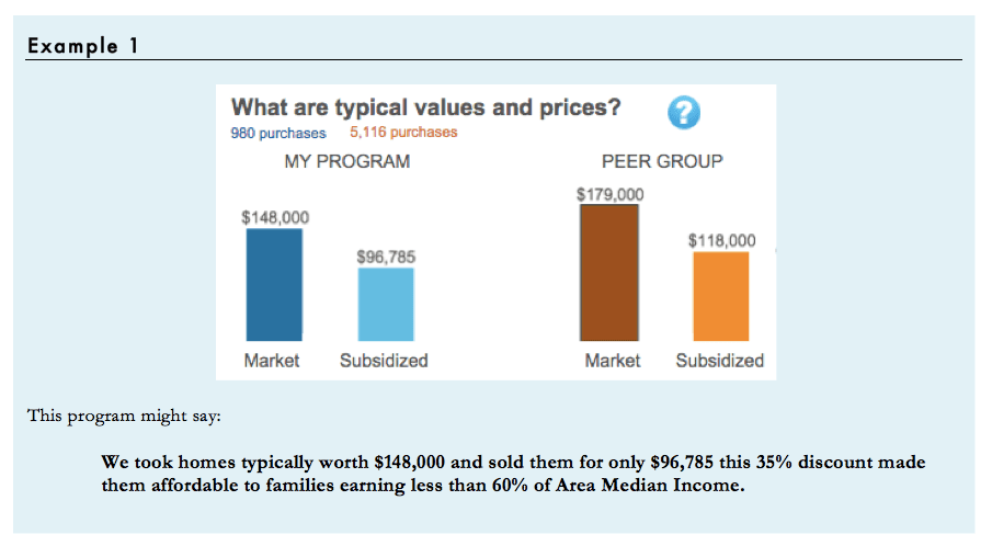
On the Community Investment dashboard, the charts present the typical (median) market value and subsidized price for program homes. The Affordability dashboard has a chart that shows what income is necessary to afford each of those prices. Together they tell a story about how the program brings homeownership within reach of lower income families.
Going Further: search on zillow.com and count how many homes in your target area are listed for less than your median subsidized price. That might help you show that you are serving buyers who are priced out of the traditional market.
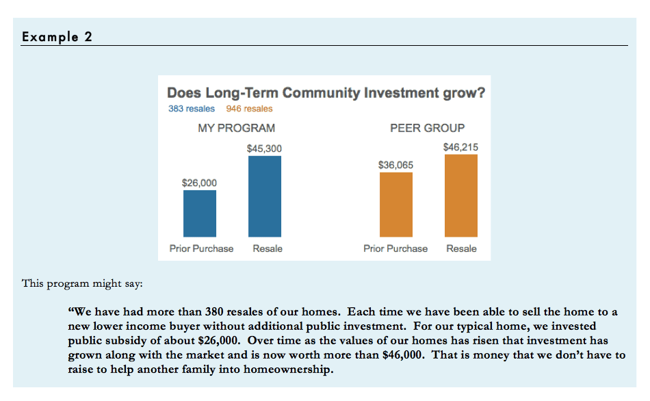
Even if your resale formula is not performing perfectly, odds are you are doing much better than other programs your local or state government is funding. People sometimes focus only on the cost of the initial investment and we have to remind them that preserving affordability means that we can serve far more families with the same investment because our programs share in the equity growth of our homes.
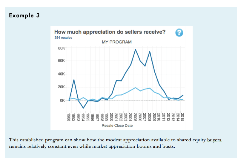
The price restrictions that protect long-term affordability limit the wealth building opportunity available to homebuyers but that does not mean that shared equity homeowners don’t build meaningful wealth through homeownership. The Social Impact dashboard makes it easier to report on the gains that homeowners receive when they sell their homes.
For the handful of HomeKeeper users that have experienced a large number of resales, the dashboard provides a snapshot of how your owners are able to earn modest but steady returns. They earn far less appreciation than market rate owners during housing boom cycle but more than market rate owners during the bust.
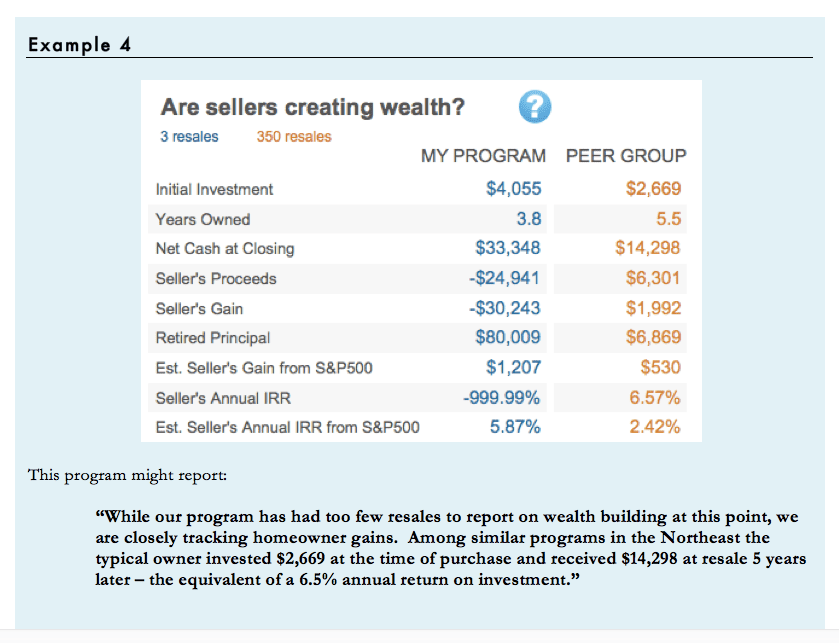
Unfortunately most HomeKeeper users are operating relatively new programs with few completed resale transactions. And the bulk of the resales that have been captured in the system occurred during the global housing market downturn. As a result many organizations will see small or negative gains for their owners for the next few years. Here again, the peer group data can help. The National or Regional peer group data may provide a better indicator of your program’s likely longer-term outcomes.
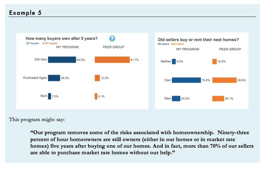
Traditionally homeownership has been risky proposition for low-income homebuyers. One study found that more than half of all low-income first time homebuyers were renting again within 5 years. The Security and Mobility dashboard can help you make the case that your program offers a more reliable path to sustainable homeownership.
Make your Program Stronger
Not every number in these reports will come as good news. Where the numbers highlight challenges, we hope people will use the data to drive internal changes. Over the past two years, we’ve heard a lot of inspiring stories about how HomeKeeper members have leveraged the insights gained from this report to improve program policies and practices.
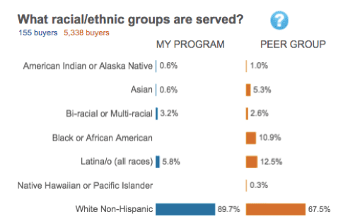
Do you ever wonder if you’re reaching all of the potential buyers that you could be? Try comparing the demographics of your homeowners to the demographic profile of your target population and see if you’re meeting your goals. If you had a hunch before, now’s the time to confront the data. If there’s a racial or ethnic group you’re underserving, why might that be and what can you do about it?
We recently shared how one community land trust used their Social Impact Report to learn that their outreach to the local Hispanic population were falling short of their expectations. They found that Hispanics made up a smaller share of their buyer population than the general population in their area so they took action to change. They reworked their procedures for Spanish speaking applicants and hired more interpreters for the intake, legal document review, and signing processes.
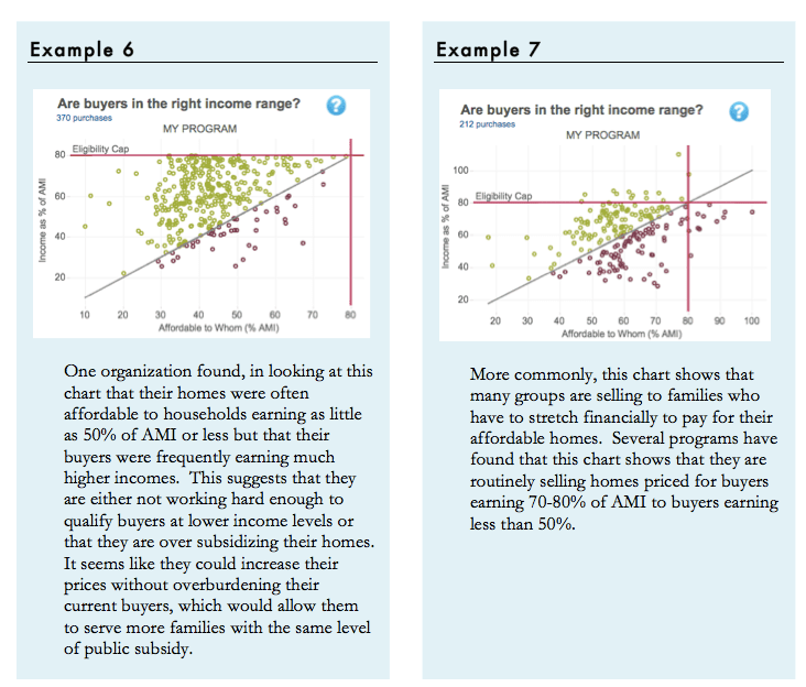
Programs also need to pay attention to the income breakdown of their buyers. We work hard to bring subsidy to the table to help people who are likely to succeed but also need help buying a home. The chart titled: €˜Are buyers in the right income range?” provides a way to monitor this delicate balance.
The chart compares the affordability of your homes (What % of AMI they are affordable to) with the incomes of the actual buyers. Dots that fall on the diagonal line across the chart represent buyers who earn exactly the percent of median income that the homes are priced to be affordable to. Dots below the line represent people who are paying more than 33% of their income to buy their unit even at the reduced price. Dots above the line represent buyers who are paying less than 33% of their income. Ideally most dots would be close to the line.
How many dots can fall below the line before we start to worry? This is where peer benchmarking can help. Everyone has some share of buyers that, for one reason or another, can safely manage housing costs that are more than 33% of their income. The Dashboard compares the share of buyers who earn enough to afford the units at the level of your pricing (the green dots on this chart) with the same number for whatever peer group you have selected. There is no reason to expect 100%, but if you are below your peers on this measure, it might be cause for concern.
Shared equity homeownership programs promise to balance two competing public goals, preserving affordability for the community at large while offering economic opportunity to individual homebuyers. They do this through somewhat complex resale pricing formulas. No one formula balances these goals perfectly so it is important to monitor the outcomes of your formula over time and make changes if the outcomes don’t match your expectations. But in the past it has been extremely difficult to track the performance of your resale formula.
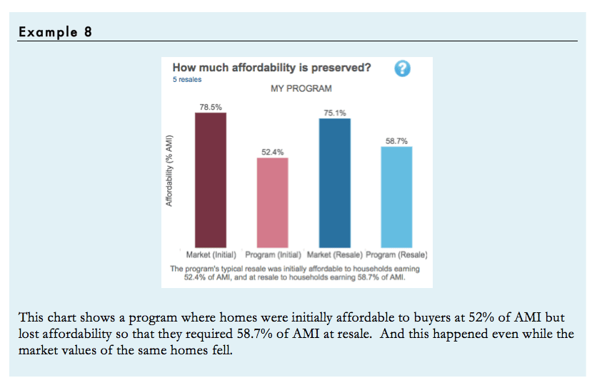
HomeKeeper was designed to make this kind of analysis a routine part of every program. First the Resale Performance dashboard shows the median affordability of your homes at the time of initial purchase and at the time of resale. Ideally homes stay the same or get slightly more affordable over time. But some programs are experiencing gradual loss of affordability which might be cause for concern.
While this change in the median affordability at resale is the clearest indicator of the success of the resale formula in protecting ongoing affordability, the dashboard allows a more detailed view which can help spot potentially worrisome trends that might not be apparent from looking at the median alone.
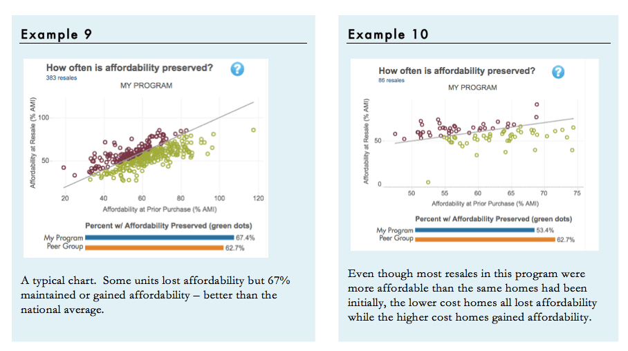
The €˜How often is affordability preserved?’ scatterplot shows each transaction. Red dots represent units that were less affordable at resale. These are not automatically cause for concern. There is no reason to expect preservation of affordability in every single transaction – instead, we expect some losses and some gains and we hope that the general trend will be toward slight gains of affordability. How many losses are acceptable? This is where peer benchmarking helps. Nationally, 62% of resales in the HomeKeeper Hub dataset preserved or gained affordability. If your program’s results are much worse than that, you might want to explore further to be sure you understand why.
Note: The extreme housing market over the past few years has pushed some resale formulas to their limits. The numbers you see today may not be representative of your program’s longer-term results. Try using the dashboard filters to compare your performance before, during and after the crash. And if you don’t have many resales yet, it is important not to read too much into these charts.
What Answers did you find?
These are just a few conversation starters to help you and your colleagues begin to explore the program data in your dashboard and the National Data Hub. There are of course many other fascinating things you can do with HomeKeeper and your program dashboard, and we hope you’ll share your ideas and insights with us as you review your report/dashboard. In future blogs we will explore other useful ways your peers have used the dashboard to generate actionable insights and measurable outcomes that you too can share with your stakeholders.