To hear other real examples of programs interpreting and interacting with their data, sign up for our 3/18 webinar, “What are the Stories Your Data is Telling?“
 Homekeeper is a Salesforce app built by Cornerstone Partnership to help long-term affordable homeownership programs manage their portfolios. The HomeKeeper National Data Hub collects and analyzes data from programs across the country that use HomeKeeper. We disseminate the analyses back to users in a detailed Social Impact Report that allows users to evaluate their programs’ performance and more effectively tell their stories to funders and policymakers.
A major challenge of this project is the tension between analyses that are simple enough to be easily understandable and actionable versus those detailed or complex enough to be meaningful across a diverse range of market and program conditions. Median values for an entire program’s transactions often have limited explanatory power because they aggregate data across those diverse conditions. On the other hand, capturing the complexity is not only technically difficult, but it makes it exponentially harder for program staff to interpret and glean actionable insight. Each time we create a new metric based on standardized assumptions, or annualize a rate of change, or show a figure relative to the market conditions of the time period, etc., we make it harder for the data to tell its story.
The solution we are experimenting with is an interactive tool that displays summary statistics while also allowing the user to drill down into their data or compare themselves to a custom-defined peer group. Here’s an example from OPAL Community Land Trust on Orcas Island, Washington:

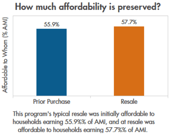
The chart above shows 2 median values for all the program’s resale transactions. It shows the gross household income required to afford the program’s subsidized prices, as a percentage of local Area Median Income adjusted for household size, at both purchase and resale. In this case, overall, OPAL’s homes appear to be losing a small amount of affordability when they sell.
Should OPAL staff be alarmed? Not necessarily. Affordable homeownership programs navigate a diverse range of market and funding conditions and juggle multiple community needs. There is no bottom line. Measuring social impact is infinitely harder than measuring profit. For example, this chart doesn’t show us how affordability preservation was affected by the way local home prices grew relative to local incomes in different time periods. It doesn’t show us which resales preserved affordability and which ones lost affordability. It doesn’t show us how other programs using different resale formulas fared during a similar time period.
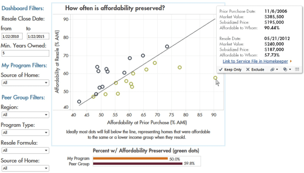
The following scatterplot helps the user begin to answer these questions. In this chart, each dot represents a resale transaction and plots its affordability levels for both sale and resale transactions. This allows the program to see trends, explore outliers, and compile a set of stories about what is actually happening. A set of filters on the sidebar allows them to drill down into the data based on resale date, length of tenure, or source of home (e.g. buyer-initiated vs. new construction). There are also filters to custom-define a peer group of other programs, to whom the small bar chart compares them by calculating the percentage of total resales that preserved affordability. The user hovers over a dot to see the details for that resale, with a link provided to view the file in Homekeeper.

Recently, Lisa Byers and Julie Brunner of OPAL CLT shared with us how they had used this chart to unearth the story behind their overall affordability preservation numbers. In some cases, resales that showed a significant loss of affordability were actually ones in which the program had provided extra subsidy to the first buyer and intentionally pulled it out at resale in order to use it elsewhere. They made that decision based on the buyers’ unique circumstances of need and the overall priorities of the program in the context of varying access to funding. This is a common practice – some programs keep price points stable and deepen subsidy as needed using deferred mortgages. In this case, the homes had not “lost affordability” in the sense of resale formula failure, even though that is what the summary stats suggested. But it took some careful interaction with the data to peel the onion enough to tell the real story.
To hear other real examples of programs interpreting and interacting with their data, sign up for our 3/18 webinar, “What are the Stories Your Data is Telling?”
**
Thane Maxwell is a consultant for Cornerstone Partnership’s HomeKeeper National Data HUB, a community organizer with Honor the Earth, and an adjunct professor in the Social Science Department at Metropolitan State University in St. Paul, MN.
